Good morning.
See also:
Covid-19 Tools #2 - Book a Vaccine or Get a Test
Covid-19 Tools #1 - Locations of Interest Maps
There are some great data visualizations out there. I will highlight the ones I know about below - do you know of others?
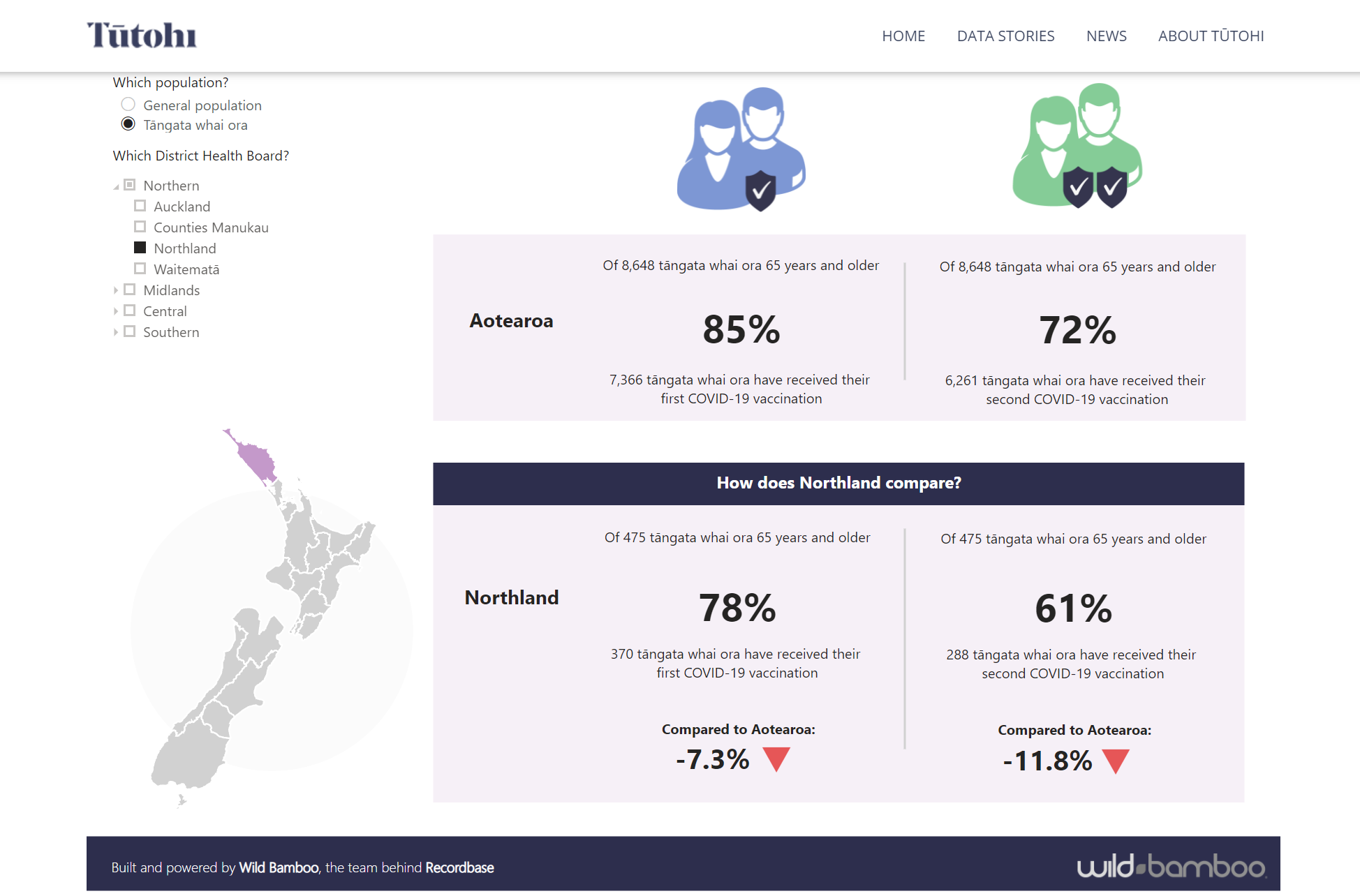
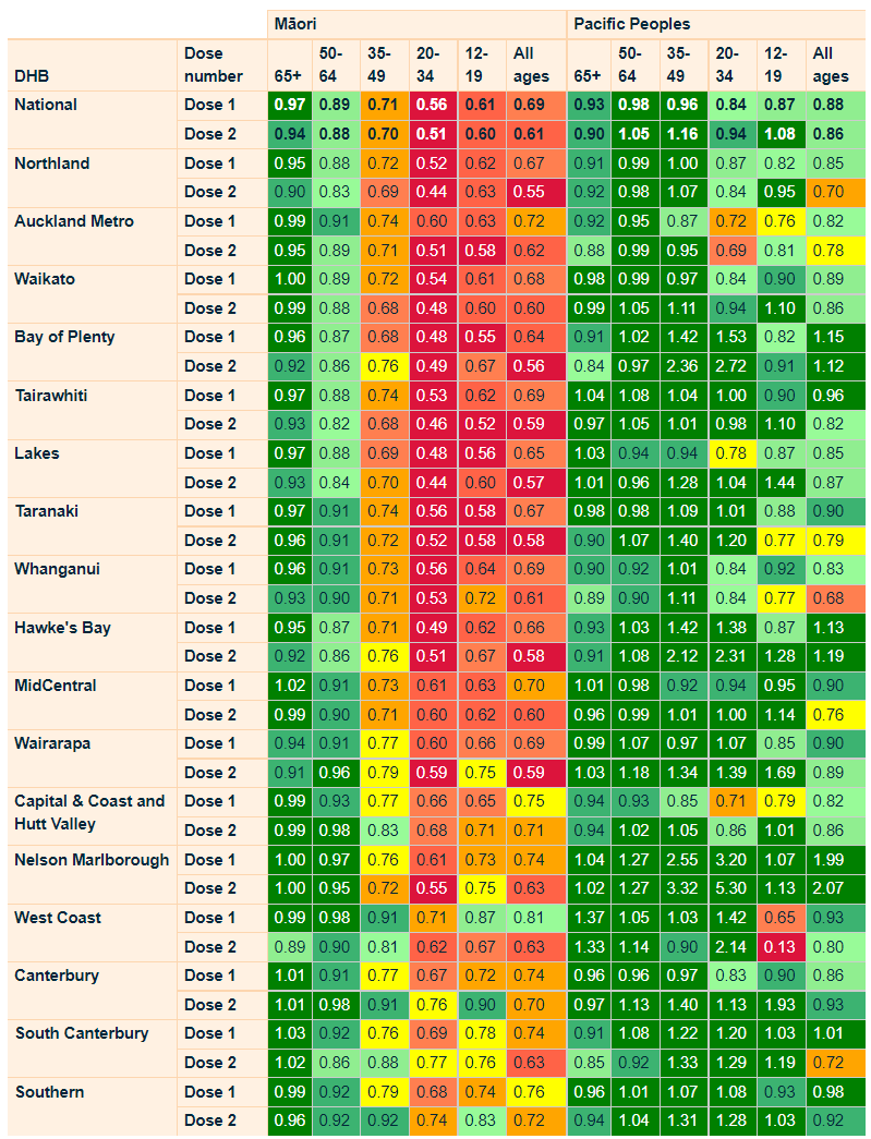
First up is Tutohi which has been kindly shared by @Nico. There has been some great work done here to use data to tell a contextual story about the comparative vaccination rates in tangata whaiora (people seeking wellness from mental illness).
Covid-19 Vaccination Rates by Tutohi
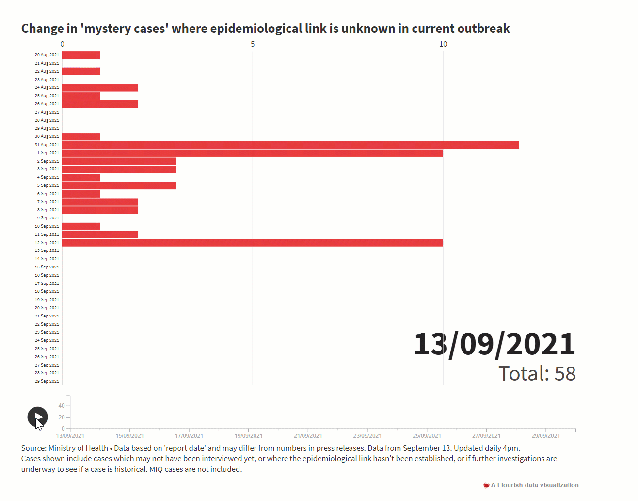
RNZ: NZ in Numbers by Farah Hancock
This is a great site - its really nice and clear. Farah uses a thing called Flourish. There are 15 different graphs and visualizations at last count - check it out.
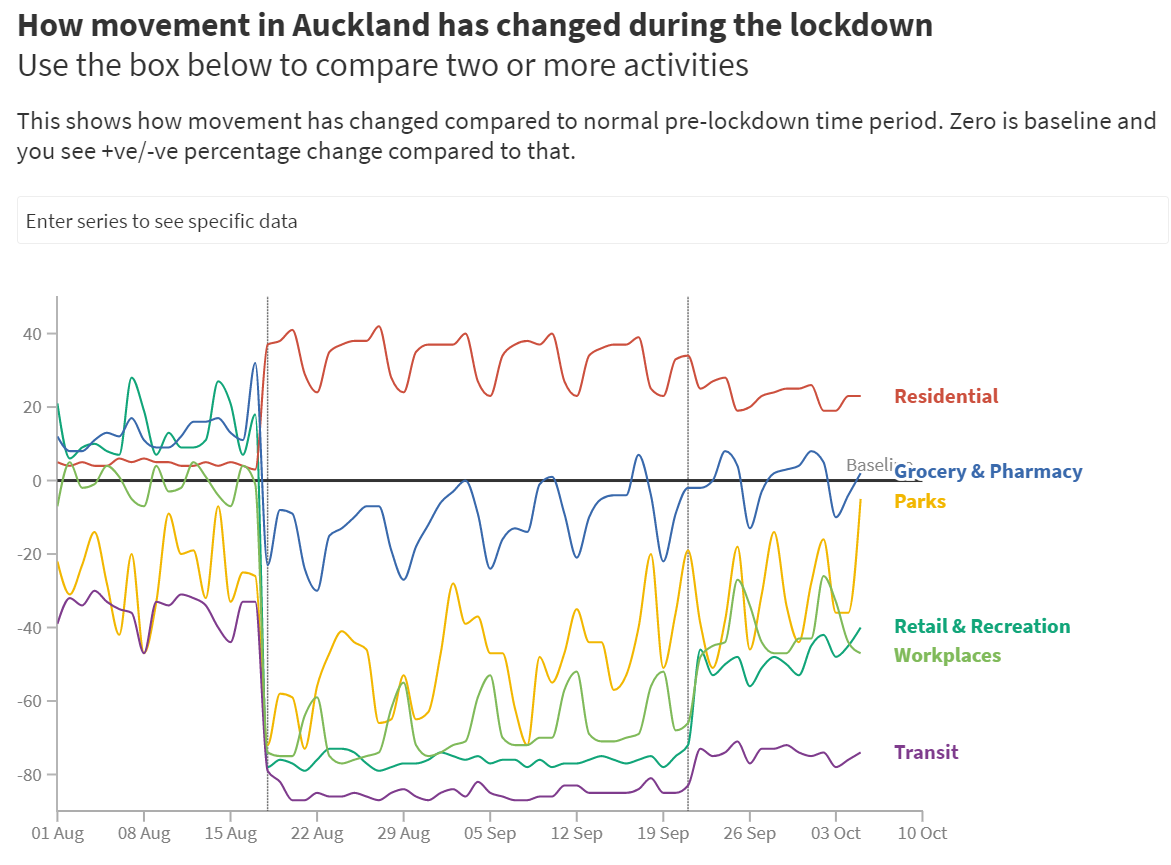
The Spinoff Covid Tracker by Harkanwal Singh
The Spinoff Covid tracker brings together heaps of Covid19 data – cases, tests, vaccination and mobility – in one place. There are 21 live graphs to help tell the story of Covid19. This gentleman does fantastic work.
Vaccination Data by MOH
There are some super graphs and charts on the MOH site.
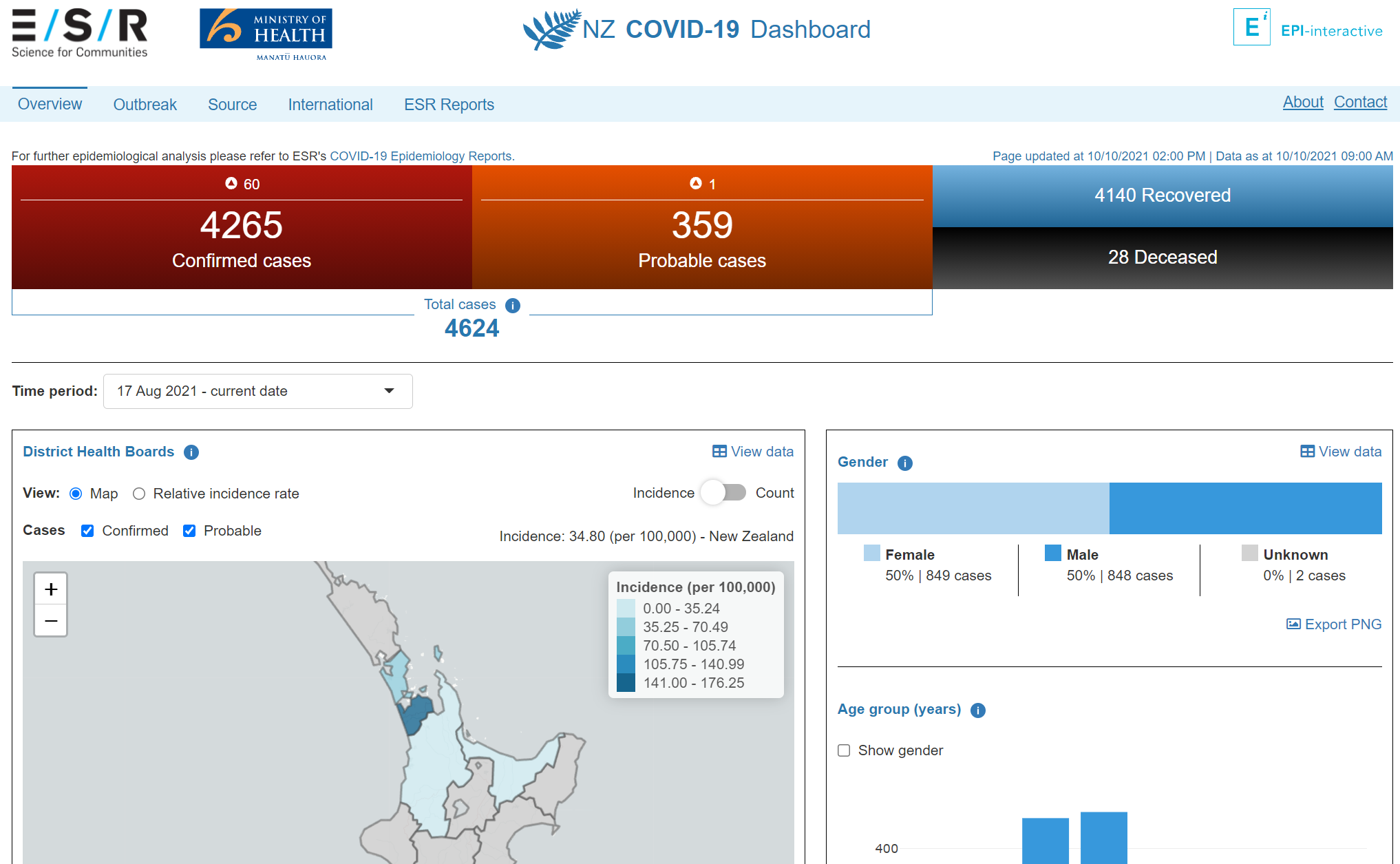
NZ Covid-19 Dashboard by ESR
The NZ COVID-19 Dashboard is provided by the Environmental Science and Research Institute (ESR). It was developed and is maintained in collaboration with Epi-interactive Ltd.
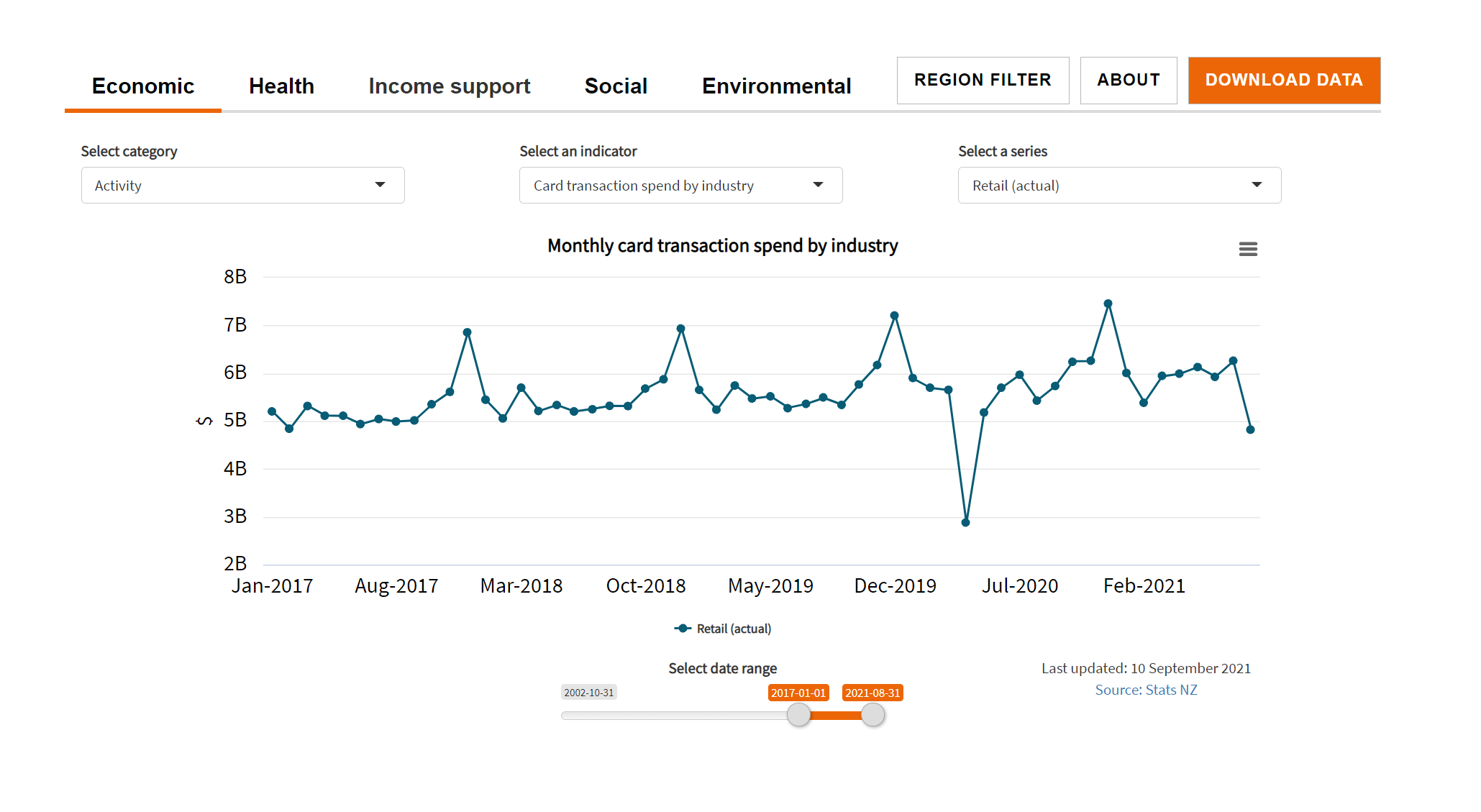
Covid-19 Data Portal by StatsNZ
This data portal has been developed and is maintained by Stats NZ. It reports on economic, environmental, and social aspects of COVID-19’s impact on New Zealand and its recovery.
The data has been sourced from Stats NZ as well as a number of other government agencies and private sector organisations.
If you know of any other great data visualisation sites for Covid19 - please share. Cheers, Ben.
PS: Please also see this post highlighting some of the different Locations of Interest maps that have been built on the back of a MOH dataset.
And click here for a collection of sites showing the different places to make a vaccination booking or to find a walk-in clinic.